The opportunity for this project was to explore how PointMan’s complex, data-heavy workflows could be translated into a clearer and more intuitive user experience. I approached this as a UX/UI case study, focusing on improving usability, information hierarchy, and task efficiency for field and office users. Working entirely in Figma, the goal was to reimagine the interface in a way that reduced friction, improved clarity, and made critical information easier to access in high-stakes environments.
All designs featured below were created by me. This includes concept development, visual design, and final production across social media, email marketing, paid advertising, and web assets.
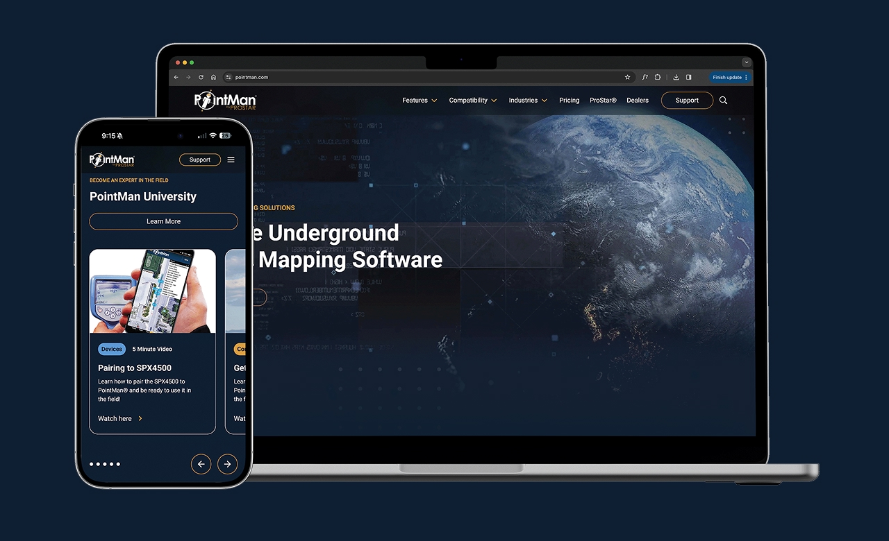
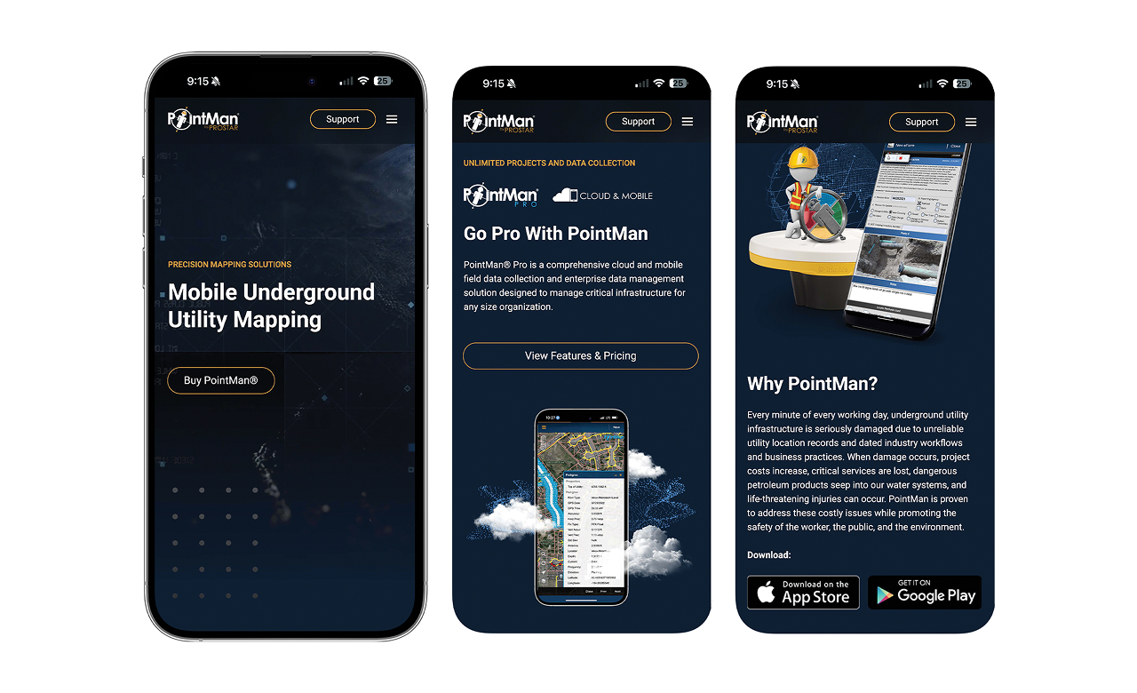

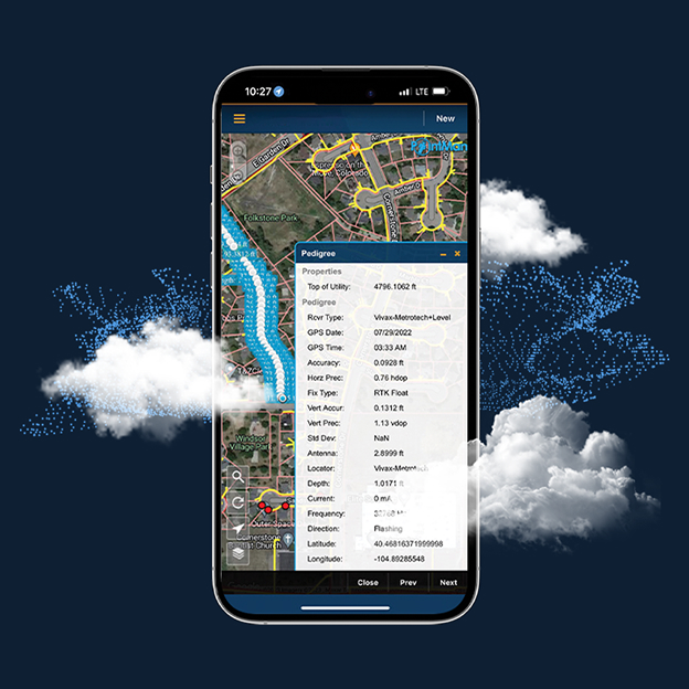
The outcome was a refined UX/UI concept that presented a cleaner, more modern interface while preserving the technical depth of the platform. The redesigned screens emphasized clarity, consistency, and usability, helping key workflows feel more approachable and efficient. While purely conceptual, the case study demonstrates a thoughtful approach to problem-solving, system-based design, and UX decision-making within a complex enterprise product.